

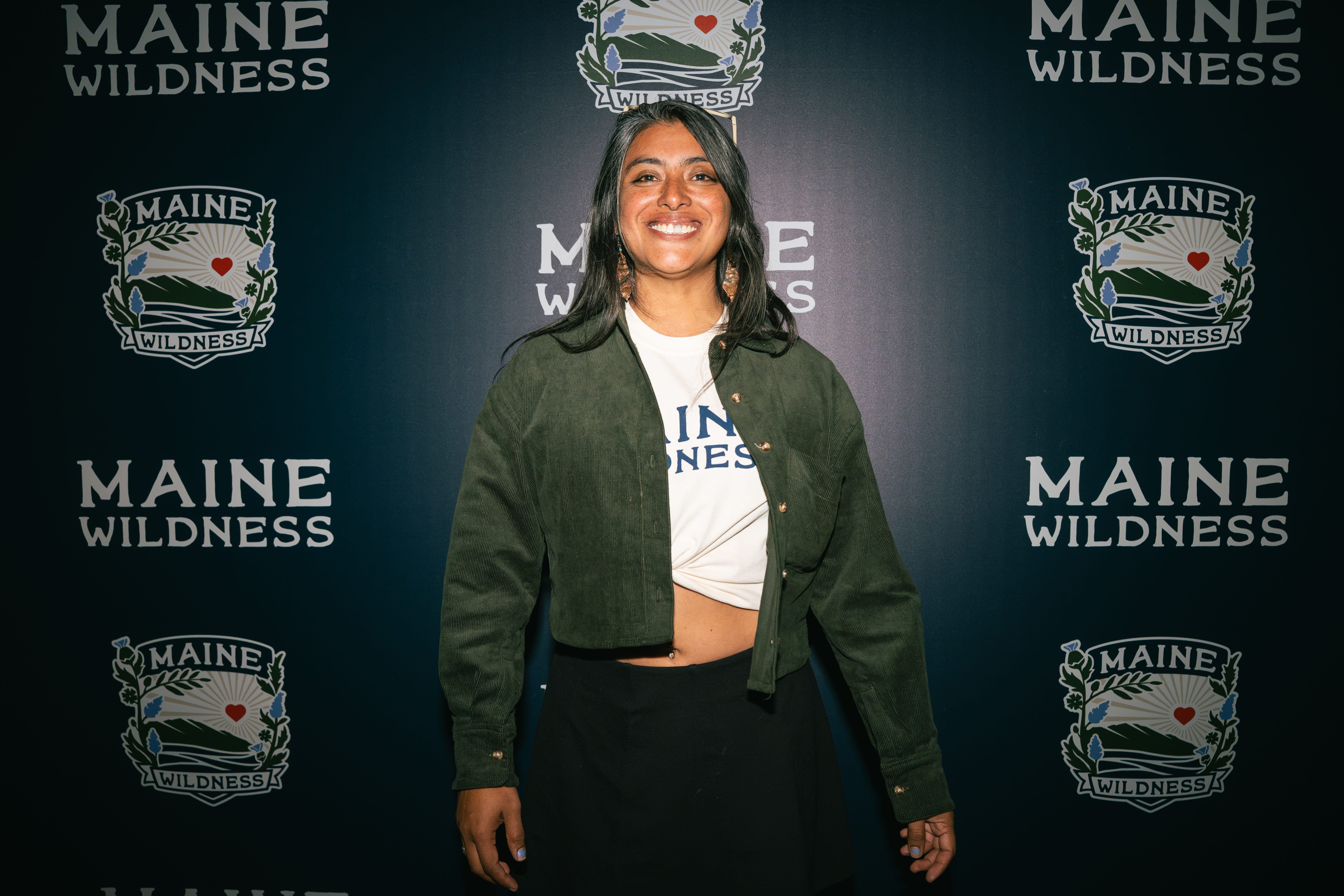
Pame Chévez grew up in Mexico City and studied graphic design there. She started out in motion graphics and animation, including work at Cocolab, a studio known for large projection shows like the one lighting up the pyramids at Teotihuacán. Her clients included Nickelodeon and Mexico’s National Institute of Anthropology and History. She moved to Maine in 2016.
In Portland, she was lead designer at Zootility, a local toolmaker, before moving into illustration and branding. She has held residencies at Indigo Arts Alliance and SPACE Gallery, and she now runs OYEH!, her own design studio. She also founded Palmar Collective, which helps people from historically excluded communities get out on the water.
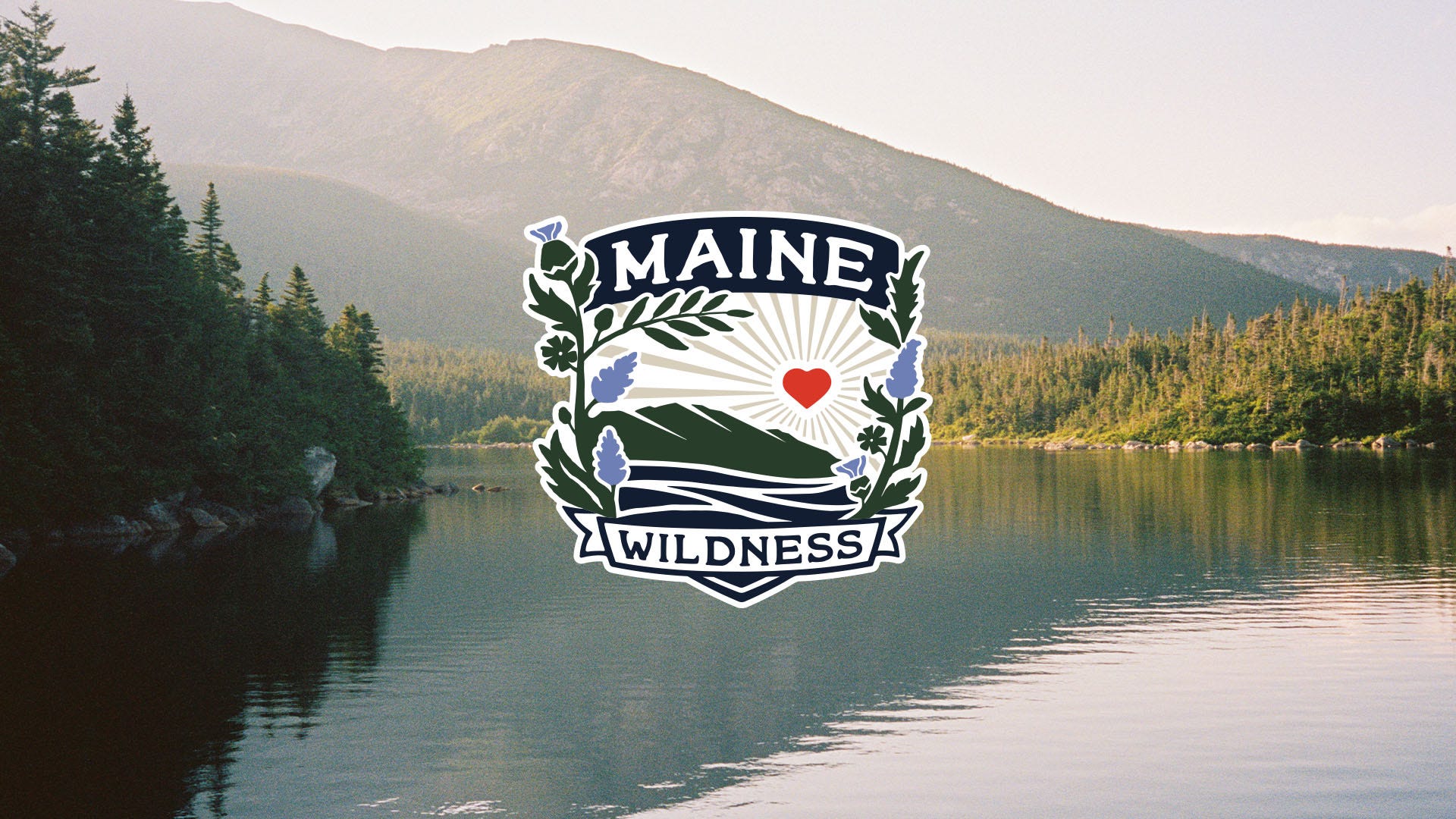
In August, she was contacted by the Soccer Club of Maine (we will let her explain those circumstances in the Q&A) and asked to design the crest for the new women’s team, the Maine Wildness. The crest was unveiled Oct. 15 and has been an instant hit with many fans.
We spoke with Chévez via Zoom, and for over 30 minutes discussed a variety of subjects related to the crest, including its genesis, while also asking what wildness means to her. Pame is short for Pamela and is pronounced PAH-meh.
Editor’s note: This interview has been edited lightly for length and clarity.
How did the club first reach out to you, and how far along were they when you came in?
Pame Chévez: The team reached out in August. They saw my work and my name because of the AIGA conference that was happening at the time. Part of the team at Hearts and myself were giving talks in that conference. They were like, “My God, we really didn’t know about you, and we are very interested in potentially working together.” We just kept talking via email about what this project was about and how they were envisioning it. They had already tried a couple times to come up with something, and they were like, “We are not getting anywhere and we need some help. We would like to see if you’d like to be part of a very nontraditional process.”
Was the name Wildness already picked when you started, or were you drawing while they were still deciding?
Chévez: They had a lot of clear ideas they wanted. One of them, the name, was already decided, and there were aspects of the existing branding that they decided they wanted to keep. It obviously ended up shifting with time and realizing that maybe keeping too much of it was not necessary.
Did they give you a sense of what they wanted?
Chévez: Yeah, they gave me some guidance. They gave me a specific brief at the moment. They didn’t want to work with any animal features in the logo, mostly because there’s other logos that include animals and could become repetitive, but also because they didn’t want it to be too specific to one thing. They really wanted just to capture Maine itself, the wilderness and that vibe of women. So they provided me with what they didn’t want at all, and what they would like to see: “We like this type of movement and how dynamic it can be, and we want to explore this idea more.”
The red heart comes from the Hearts of Pine logo. What’s it like building your design around a piece that was already there?
Chévez: It was very challenging. It’s something we are used to as designers, just to respect brand guidelines that already exist. But trying to give a voice to a different audience, a different group that needs to be represented, was very hard when you have branding that works great, but it was oriented to a male audience, right? So it was trying to grab a little bit of that and meet them in the middle. Or not them, but the existing brand. We need to respect a lot of the style, which is not necessarily fully my style. I had to adapt a lot of my original style to the existing style so that it could exist and feel like they were intertwined and they were part of the same world.
How did you keep it from looking just like the Hearts logo with flowers added?
Chévez: That process was a little hard. More than hard, challenging, because there was this idea of wanting to keep certain aspects of the existing brand, and at some point it included pine trees. It got to the point where I was like, “Listen, I can understand that, but at this point if we keep just working with these elements, it just looks like a rearrangement of your original logo for the Hearts, and I think the pines need to go.” The pine trees don’t exist in this place, not per se as an actual object. So that was a very hard decision. We tried to explore with rivers, we tried to explore with silhouettes, or just the path that a river follows.
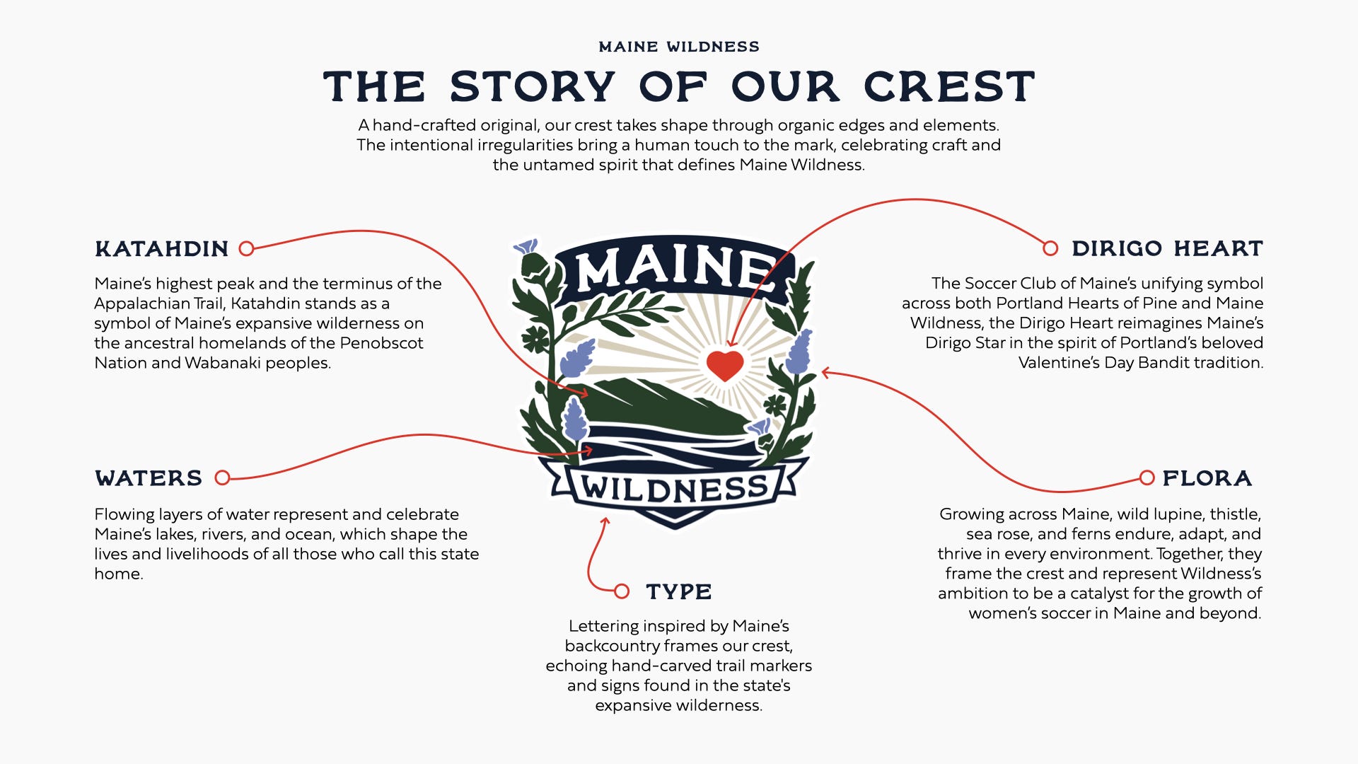
I feel like an element that really made a shift into it, even though we ended up going through landscape, was combining elements that aren’t necessarily next to each other. We thought of Katahdin, a beautiful mountain. It’s very important for the Penobscot community. And bringing that silhouette, but with a different treatment to the water, more ocean vibes rather than very geometric and simplified curves, but more into the movement. I think it’s what helps separate it and give it more of a personality, where it’s not super geometric, but it’s more flowy in its way.
Thinking of it as, how can we break this mold of a shield, right? Every crest comes in a specific type of shield, and trying to stay with the shield, but break it a little bit. Kind of get out of your line a little bit. Breaking the frame was very important and vital to it. And the typography as well. The existing one was just not working for what we were trying to create. So changing those elements, font, adding color, focusing of movement rather than geometry and precision, was the key to it.
Most team crests are balanced, right there in the middle, and yours is not. It makes it much more distinct.
Chévez: Yeah, it’s definitely what we were trying to do. Trying to not make it symmetric, make it a little bit more asymmetric, but without exaggerating.
Why those four plants, the lupine, the thistle, the beach rose and the fern? What did each one have to earn to make the cut?
Chévez: There’s the love people have for lupines, right? Lupines are a very distinctive part of the landscape. Most of the lupines that we see out there are not the native ones, though. But we wanted to honor the native lupine that actually exists in Maine.
The beach rose was to speak more about the women that are water women, in the ocean. I think wildness in Maine is not necessarily just focused on the forest and what we have inland. I feel like a lot of women resonate a lot with the ocean, with the coast.
Then we have the ferns, which are very resilient plants. You have fiddleheads that are very nurturing, but also when they open up, they become this beautiful fern and they just take over. Even when it has a pattern, it also feels like it takes its own journey.
The thistle, that flower, is very native to Maine. It has this very specific shape that is not what you would expect from a flower. I think that’s also a part of it, to represent the difference and the diversity that exists within the community, the women and femme community in Maine.
How did the women who showed you Maine shape this work?
Chévez: Women in Maine definitely inspire me a lot. When I first moved to Maine, most of my community was shaped by women. There were all these women who were sailors, who were gardeners, who were paddlers, kayakers, hikers, a lot of women who were just thriving outside. That’s what really kept me and connected me to Maine. I think all that knowledge I took from each woman that I spent time with in my time in Maine has to do with this.
Every little thing they showed me, I fell in love with. I fell in love with hiking. I fell in love with snowboarding, the mountains, because I had a wonderful friend that showed me all those things. I had wonderful people in my life that are gardeners. They just taught me so much, so many corners of Maine that I ended up loving and just feeling part of it. Because I feel like the most important part of being a human is just recognizing that your connection with nature is because you are part of nature, and because you belong there. That opened up a sense of belonging for me and made me love Maine even more.
What Indigenous stories about Maine have stayed with you, and how did they show up in the design?
Chévez: When I first moved to Maine, my partner at the time took me to Katahdin for the first time. Katahdin was probably my second hike in my life, and it was a struggle. It was very rough. It was 11 hours nonstop. But I definitely enjoyed it, and that gave me curiosity for the mountain. I bought a book about Katahdin and I started reading it.
It started mentioning stories and the legends around the mountain, and that just brought me back home. We have so many stories around the mountains back in Mexico. I was like, I want to learn about this. I know a lot about my country, where I come from, and all these legends that are set around nature, because it’s a way of explaining nature. It just interested me more. And there is the legend of Katahdin and Pamola, and what Pamola represents, and this emotion and intensity and this passion, I would say, impredictability.
One of the things they tell you when you go to Katahdin is watch out for the Knife Edge, because you never know when it’s going to get windy. So it’s that part of wildness, right? It’s just, sometimes there needs to be a current and it will happen. It’s not asking for permission. It’s existing. It’s wanting to just be free while also belonging in the space.
As a woman who came here from somewhere else, what does wildness mean to you?
Chévez: That’s a very interesting question. Coming from afar, or from a different part of the continent, I grew up in a big city. What you would describe as wildness there is completely different from what you would describe as wildness in the outdoor world, being around nature. I think for me, being part of those two things, to be wild is to be resilient. It’s to be moving free, learning in the process, not being scared of living, to just move through the paths. I go for a hike or I go to places I don’t know, and it takes me back to living in a city. How am I going to get to places? I have to thrive and ask and connect with locals to get to know more about the area.
Wildness is just to take that opportunity to live it. Take that opportunity of the unknown and live it, because ultimately it’s what makes you free to just be able to go and get through everything that life throws at you. That’s nature, basically. It’s this freedom of being able to feel the downs, the ups, but to continue the journey. To be wild is to maybe not give up, to just keep going.
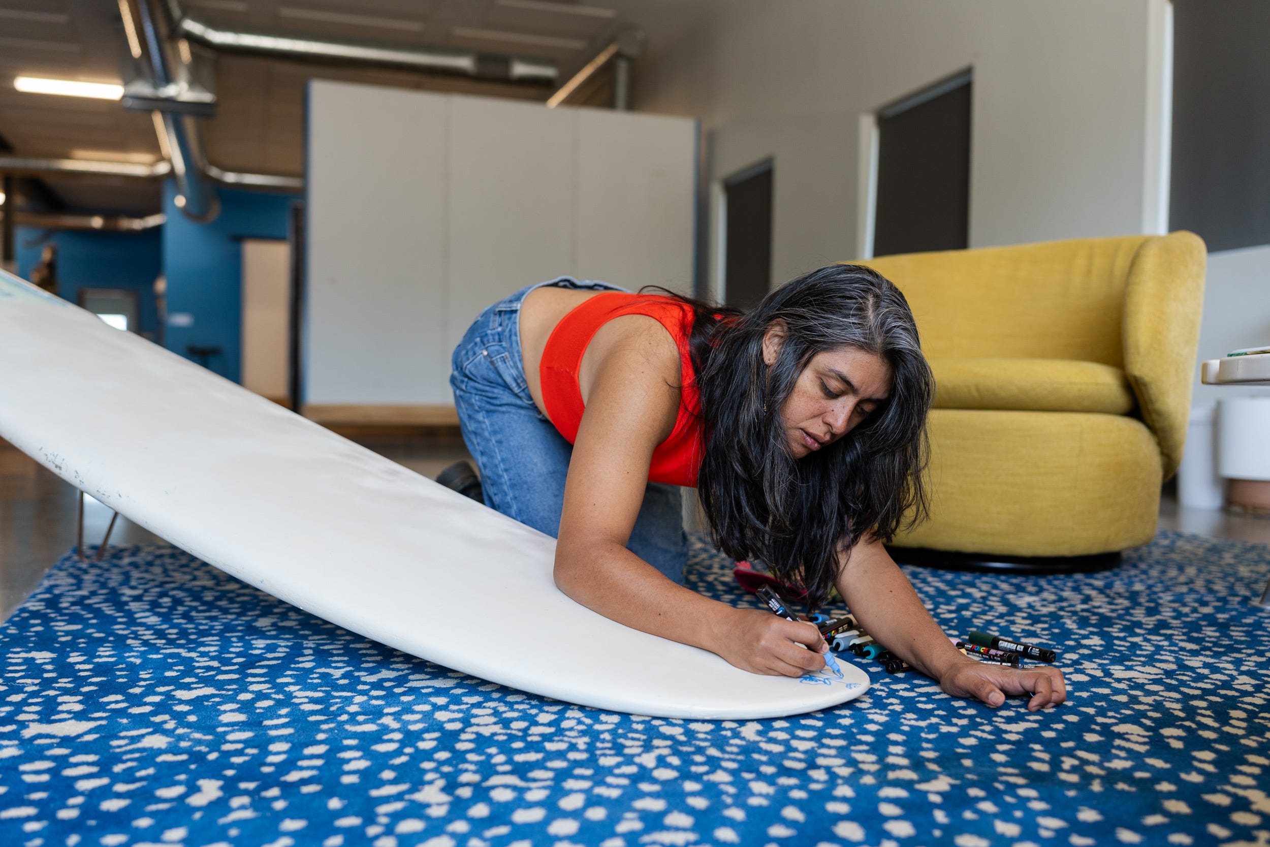
How many versions did you go through? And is there one that didn’t make it that you still love?
Chévez: Yes, there’s always that one, that piece that you wish had stuck. I lost count of the variations we did, because it was not a traditional process. It was very unique. There were a lot of stakeholders at the beginning trying to decide, is this going to work? So there were so many voices that you needed to kind of put into place. The variations that happened were more than we had planned. Ultimately, I think we ended up going back to things that we originally wanted, just a different approach, and it ended up working great.
Yes, there’s that piece that I wish had stayed. It’s so much more coastal driven, and you can see more of the movement in it. There’s no landscape. It’s just more an integration of elements, but not necessarily as a landscape. It didn’t make the cut because it was just very focused on water from the ocean, and the currents, and that rugged sense you get from the rocks in Maine, and the waves crashing. It was beautiful. A lot of people on the team liked it too, but there was a need to respect some of the elements from the brand, and at that moment, there were too many left out. We had to go back to the original.
Is there a detail in the crest that you hope people finally notice five years from now?
Chévez: Everything was made with so much intention. For example, how the leaves follow the shape of the shield was very much intentional. We didn’t want it to just be chaotic. There were so many variations we tried to bring Katahdin as the shape of the shield rather than being present there.
Part of the lupines were little hearts. Some of the leaves are made of hearts that are together, so you can’t see them at first glance. But some of the leaves, I think I left one there. It’s just a very imperfect heart, because we wanted to make reference to it, but we didn’t want to saturate it.
What do you hope a 10-year-old girl in the stands sees when she looks at the crest?
Chévez: I hope the young girl that sees this really, really thinks it’s possible, right? I wish that they see this crest and they’re like, we are great. We are big. As a community of women and femme community, we are powerful. We are strong. We are much more than what anyone else would want to put in a box for us. We are more than that box.
I hope that they understand that there is a greatness that they can be. There’s much more than what people present to us. That it’s possible, whatever you want to be doing out there. You can play soccer, you can play basketball, you can be a designer and work on these types of projects. You can be what you want to be.


